 ☰
🔍
☰
🔍
 ☰
🔍
☰
🔍
10 May 2023
It has been almost two years since we launched the first stable version of Jetpack Compose, and since then, we’ve seen its adoption and feature set grow spectacularly. Whether you write an application for smartphones, foldables, tablets, ChromeOS devices, smartwatches, or TVs, Compose has got you covered! We recommend you to use Compose for all new Wear OS, phone and large-screen apps. With new tooling and library features, extended Material Design 3, large screen, and Wear OS support, and alpha versions of Compose for homescreen widgets and TV… This is an exciting time!
In the last year, we’ve seen many companies investigating and choosing Compose to build new features and migrate screens in their production applications. 24% of the top 1000 apps on Google Play have already chosen to adopt Compose! For example, Dropbox engineers told us that they rewrote their search experience in Compose in just a few weeks, which was 40% less time than anticipated, and less than half the time it took the team to build the feature on iOS. They also shared that they were interested in adopting Compose “because of its first-class support for design systems and tooling support”. Our Google Drive team cut their development time nearly in half when using Compose combined with architecture improvements.
It’s great to see how these teams experience faster development cycles, and also feel their UI code is more testable. Inspired? Start by reading our guide How to Adopt Compose for your Team, which outlines how and where to start, and shows the areas of development where Compose can bring huge added value.
Since we released the first Compose Bill of Materials in October last year, we’ve been working on new features, bug fixes, performance improvements, and bringing Compose to everywhere you build UI: phones, tablets, foldables, watches, TV, and your home screen. You can find all changes in the May 2023 release and the latest alpha versions of the Compose libraries.
We’ve heard from you that performance is something you care about, and that it’s not always clear how to create performant Compose applications. We’re continuously improving the performance of Compose. For example, as of last October, we started migrating modifiers to a new and more efficient system, and we’re starting to see the results of that migration. For text alone, this work resulted in an average 22% performance gain that can be seen in the latest alpha release, and these improvements apply across the board. To get these benefits in your app, all you have to do is update your Compose version!
Text and TextField got many upgrades in the past months. Next to the performance improvements we already mentioned, Compose now supports the latest emoji version
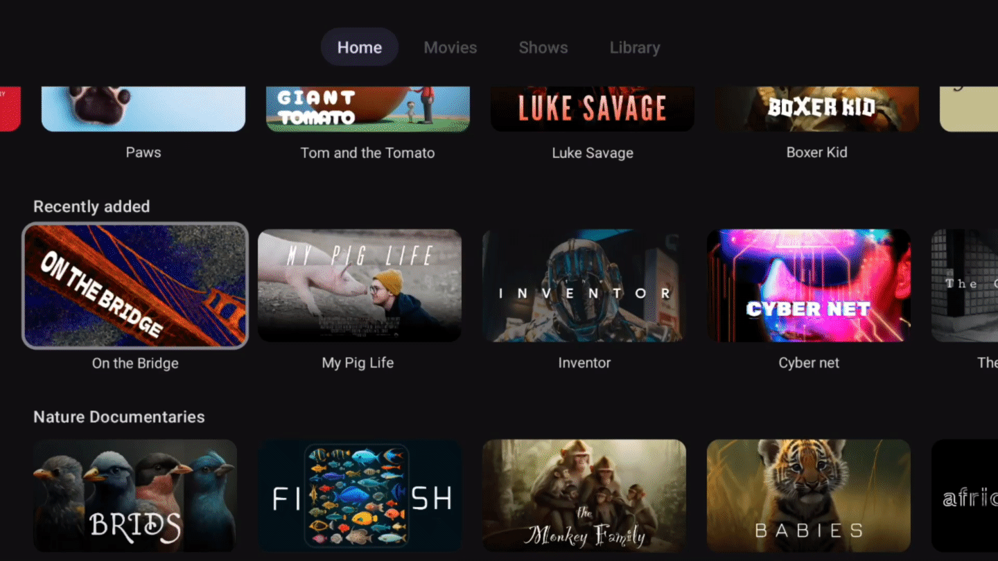
The new pager component allows you to horizontally or vertically flip through content, which is similar to ViewPager2 in Views. It allows deep customization options, making it possible to create visually stunning effects:

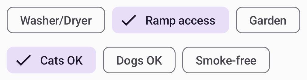
The new flow layouts FlowRow and FlowColumn make it easy to arrange content in a vertical or horizontal flow, much like lines of text in a paragraph. They also enable dynamic sizing using weights to distribute the items across the container.
To learn more about the new features, performance improvements, and bug fixes, see the release notes of the latest stable and newest alpha release of the Compose libraries.
Developing your app using Jetpack Compose is much easier with the new and improved tools around it. We added tons of new features to Android Studio to improve your workflow and efficiency. Here are some highlights:
Android Studio Flamingo is the latest stable release, bringing you:
Android Studio Giraffe is the latest beta release, containing features such as:
Android Studio Hedgehog contains canary features such as:
We’re also actively working on visual linting and accessibility checks for previews so you can automatically audit your Compose UI and check for issues across different screen sizes, and on multipreview templates to help you quickly add common sets of previews.
Material 3 is the recommended design system for Android apps, and the latest 1.1 stable release adds a lot of great new features. We added new components like bottom sheets, date and time pickers, search bars, tooltips, and others. We also graduated many of the core components to stable, added more motion and interaction support, and included edge-to-edge support in many components. Watch this video to learn how to implement Material You in your app:
We’ve continued our efforts to make development for large screens easy when you use Compose. The pager and flow layouts that we released are common patterns on large screen devices. In addition, we added a new Compose library that lets you observe the device’s window size class so you can easily build adaptive UI.
When attaching a mouse to an Android device, Compose now correctly changes the mouse cursor to a caret when you hover the cursor over text fields or selectable text. This helps the user to understand what elements on screen they can interact with.

Today we publish the first beta version of the Jetpack Glance library! Glance lets you develop widgets optimized for Android phone, tablet, and foldable homescreens using Jetpack Compose. The library gives you the latest Android widget improvements out of the box, using Kotlin and Compose:

We launched Compose for Wear OS 1.1 stable last December, and we’re working hard on the new 1.2 release which is currently in alpha. Here’s some of the highlights of the continuous improvements and new features that we are bringing to your wrist:
You can now build pixel perfect living room experiences with the alpha release of Compose for TV! With the new AndroidX TV library, you can apply all of the benefits of Compose to the unique requirements for Android TV. We worked closely with the community to build an intuitive API with powerful capabilities. Engineers from Soundcloud shared with us that “thanks to Compose for TV, we are able to reuse components and move much faster than the old Leanback View APIs would have ever allowed us to.” And Plex shared that “TV focus and scrolling support on Compose has greatly improved our developer productivity and app performance.”
Compose for TV comes with a variety of components such as ImmersiveList and Carousel that are specifically optimized for the living room experience. With just a few lines of code, you can create great TV UIs.
TvLazyColumn {
  items(contentList) { content ->
    TvLazyRow {
       items(content) { cardItem ->
          Card(cardItem)
       }
    }
}
Learn more about the release in this blog post, check out the “What’s new with TV and intro to Compose” talk, or see the TV documentation!
It’s great to see more and more internally and externally developed libraries add support for Compose. For example, loading pictures asynchronously can now be done with the GlideImage composable from the Glide library. And Google Maps released a library which makes it much easier to declaratively create your map implementations.
GoogleMap(
  //...
) {
    Marker(
        state = MarkerState(position = LatLng(-34, 151)),
        title = "Marker in Sydney"
    )
    Marker(
        state = MarkerState(position = LatLng(35.66, 139.6)),
        title = "Marker in Tokyo"
    )
}
No matter where you are in your learning journey, we’ve got you covered! We added and revamped a lot of the guidance on Compose:
We hope you're as excited by these developments as we are! If you haven't started yet, it's time to learn Jetpack Compose and see how your team and development process can benefit from it. Get ready for improved velocity and productivity. Happy Composing!
Android Developers


 Google Play


 Posted by