 ☰
🔍
☰
🔍
03 March 2009
In the previous installment of Android Layout Tricks, I showed you how to use the <include /> tag in XML layout to reuse and share your layout code. I also mentioned the <merge /> and it's now time to learn how to use it.
The <merge /> was created for the purpose of optimizing Android layouts by reducing the number of levels in view trees. It's easier to understand the problem this tag solves by looking at an example. The following XML layout declares a layout that shows an image with its title on top of it. The structure is fairly simple; a FrameLayout is used to stack a TextView on top of an ImageView:
<FrameLayout xmlns:android="http://schemas.android.com/apk/res/android"
    android:layout_width="fill_parent"
    android:layout_height="fill_parent">

    <ImageView
        android:layout_width="fill_parent"
        android:layout_height="fill_parent"

        android:scaleType="center"
        android:src="@drawable/golden_gate" />

    <TextView
        android:layout_width="wrap_content"
        android:layout_height="wrap_content"
        android:layout_marginBottom="20dip"
        android:layout_gravity="center_horizontal|bottom"

        android:padding="12dip"

        android:background="#AA000000"
        android:textColor="#ffffffff"

        android:text="Golden Gate" />

</FrameLayout>
This layout renders nicely as we expected and nothing seems wrong with this layout:

Things get more interesting when you inspect the result with HierarchyViewer. If you look closely at the resulting tree you will notice that the FrameLayout defined in our XML file (highlighted in blue below) is the sole child of another FrameLayout:

Since our FrameLayout has the same dimension as its parent, by the virtue of using the fill_parent constraints, and does not define any background, extra padding or a gravity, it is totally useless. We only made the UI more complex for no good reason. But how could we get rid of this FrameLayout? After all, XML documents require a root tag and tags in XML layouts always represent view instances.
That's where the <merge /> tag comes in handy. When the LayoutInflater encounters this tag, it skips it and adds the <merge /> children to the <merge /> parent. Confused? Let's rewrite our previous XML layout by replacing the FrameLayout with <merge />:
<merge xmlns:android="http://schemas.android.com/apk/res/android">

    <ImageView
        android:layout_width="fill_parent"
        android:layout_height="fill_parent"

        android:scaleType="center"
        android:src="@drawable/golden_gate" />

    <TextView
        android:layout_width="wrap_content"
        android:layout_height="wrap_content"
        android:layout_marginBottom="20dip"
        android:layout_gravity="center_horizontal|bottom"

        android:padding="12dip"

        android:background="#AA000000"
        android:textColor="#ffffffff"

        android:text="Golden Gate" />

</merge>
With this new version, both the TextView and the ImageView will be added directly to the top-level FrameLayout. The result will be visually the same but the view hierarchy is simpler:

Obviously, using <merge /> works in this case because the parent of an activity's content view is always a FrameLayout. You could not apply this trick if your layout was using a LinearLayout as its root tag for instance. The <merge /> can be useful in other situations though. For instance, it works perfectly when combined with the <include /> tag. You can also use <merge /> when you create a custom composite view. Let's see how we can use this tag to create a new view called OkCancelBar which simply shows two buttons with customizable labels. You can also download the complete source code of this example. Here is the XML used to display this custom view on top of an image:
<merge
    xmlns:android="http://schemas.android.com/apk/res/android"
    xmlns:okCancelBar="http://schemas.android.com/apk/res/com.example.android.merge">

    <ImageView
        android:layout_width="fill_parent"
        android:layout_height="fill_parent"

        android:scaleType="center"
        android:src="@drawable/golden_gate" />

    <com.example.android.merge.OkCancelBar
        android:layout_width="fill_parent"
        android:layout_height="wrap_content"
        android:layout_gravity="bottom"

        android:paddingTop="8dip"
        android:gravity="center_horizontal"

        android:background="#AA000000"

        okCancelBar:okLabel="Save"
        okCancelBar:cancelLabel="Don't save" />

</merge>
This new layout produces the following result on a device:

The source code of OkCancelBar is very simple because the two buttons are defined in an external XML file, loaded using a LayoutInflate. As you can see in the following snippet, the XML layout R.layout.okcancelbar is inflated with the OkCancelBar as the parent:
public class OkCancelBar extends LinearLayout {
    public OkCancelBar(Context context, AttributeSet attrs) {
        super(context, attrs);
        setOrientation(HORIZONTAL);
        setGravity(Gravity.CENTER);
        setWeightSum(1.0f);

        LayoutInflater.from(context).inflate(R.layout.okcancelbar, this, true);

        TypedArray array = context.obtainStyledAttributes(attrs, R.styleable.OkCancelBar, 0, 0);

        String text = array.getString(R.styleable.OkCancelBar_okLabel);
        if (text == null) text = "Ok";
        ((Button) findViewById(R.id.okcancelbar_ok)).setText(text);

        text = array.getString(R.styleable.OkCancelBar_cancelLabel);
        if (text == null) text = "Cancel";
        ((Button) findViewById(R.id.okcancelbar_cancel)).setText(text);

        array.recycle();
    }
}
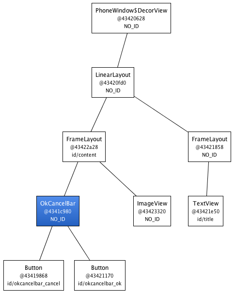
The two buttons are defined in the following XML layout. As you can see, we use the <merge /> tag to add the two buttons directly to the OkCancelBar. Each button is included from the same external XML layout file to make them easier to maintain; we simply override their id:
<merge xmlns:android="http://schemas.android.com/apk/res/android">
    <include
        layout="@layout/okcancelbar_button"
        android:id="@+id/okcancelbar_ok" />

    <include
        layout="@layout/okcancelbar_button"
        android:id="@+id/okcancelbar_cancel" />
</merge>
We have created a flexible and easy to maintain custom view that generates an efficient view hierarchy:

The <merge /> tag is extremely useful and can do wonders in your code. However, it suffers from a couple of limitation:
<merge /> can only be used as the root tag of an XML layout<merge />, you must specify a parent ViewGroup and you must set attachToRoot to true (see the documentation of the inflate() method)In the next installment of Android Layout Tricks you will learn about ViewStub, a powerful variation of <include /> that can help you further optimize your layouts without sacrificing features.