 ☰
🔍
☰
🔍
 ☰
🔍
☰
🔍
18 maio 2021
Posted by Oscar Wahltinez, Developer Relations Engineer, Google
Users are seeing more value in larger screens, and the benefits of doing more with a single device. Apps designed for large screen devices increase those benefits even further.
The ability to fold a screen offers better ergonomics for large devices. When folded, you can fit a tablet-sized screen in your pocket — unlocking utility that was previously unavailable on a portable device. Thinking about our app ecosystem, we’re excited because this is a hardware shift that is driving new expectations around what you can do from a handheld device. We see the demand for larger screens extending to tablets too, which have greatly increased in popularity, given the similar app experience.
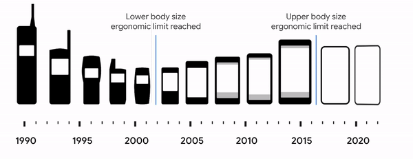 |
| Technological breakthroughs and our understanding of ergonomics have played a role in device form factors. |
In this blog post, we'll explain what you should do to prepare your apps for large screens, and how recent updates have made developing your app easier. But first, let’s talk about what we're seeing with large screens — and why you should optimize your app.
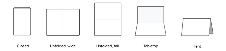 |
| There are many ways to use foldable devices, including a number of postures illustrated here. |
Over the past year, we’ve seen device makers release exciting new foldable and tablet devices. Demand has increased as users are doing more than ever from these devices. Altogether, developers can reach more than 250 million active foldables, tablets, and Chromebooks by building for Android large screen devices today. Sales of tablet devices grew 16% in 2020 with analysts expecting more than 400 million Android tablets by 2023, and foldables are redefining what’s possible on premium devices. Android apps can also run on ChromeOS, which is now the second most popular desktop OS.
Larger screens are changing how users interact with their device. These devices allow you to edit slide decks while looking at notes, look up restaurant recommendations while planning a night out, or watch a video while chatting with friends. Let’s talk about base-level support — features an app must support to be “large screen ready”. There are three main areas of focus when it comes to large screen readiness:
- Designing for large screens
- Multitasking
- Input modes
They’re summarized below, but make sure to check out our large screen app quality guidelines for the full details.
Design for large screensThe first step is to ensure that your app is designed for large screens. To make this easier, we’ve defined specific window size breakpoints and device classes for you to optimize for. Add tablet layouts for displays where the shortest dimension is >600dp, and ensure your apps go edge-to-edge. Developers should also plan for their app to be used in both portrait and landscape modes, since larger screens are more likely to be used in landscape. We’ve got material adaptive components that we’ll be talking about to help developers make better use of the increased space.
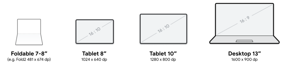 |
| Since foldable and large screen devices have a variable window size, adaptive layouts work better than splitting experiences based on screen size. |
Going into split screen (or multi-window mode) and gestures like drag and drop are starting to become natural interactions that users expect to work seamlessly in their large screen devices. Your apps should handle multitasking seamlessly by being resizable. Handling folding and unfolding events and planning for your app to be in multi-window mode prevents your app from becoming letterboxed.
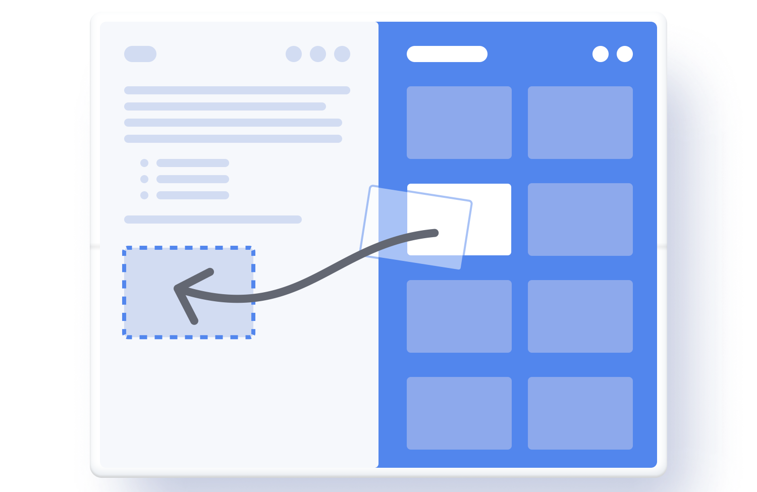 |
| Drag and drop can be a natural interaction in large screen layouts, even within the same app. |
 |
| By enabling multiple instance support, users can run multiple copies of your app side-by-side. The let’s users compare two products, reference notes while writing a document or maybe keeping your calendar in view as you are planning an event. |
Since many people use larger screens for productivity, tablets should support basic keyboard, mouse and stylus usage.
 |
| Users of Android apps on ChromeOS devices often have a keyboard; apps should ensure that standard keyboard navigation and shortcuts are available to provide improved accessibility. |
Several UI components across Jetpack and Material Design libraries have been updated to help you build a flexible user experience to scale your phone's UI to a larger screen.
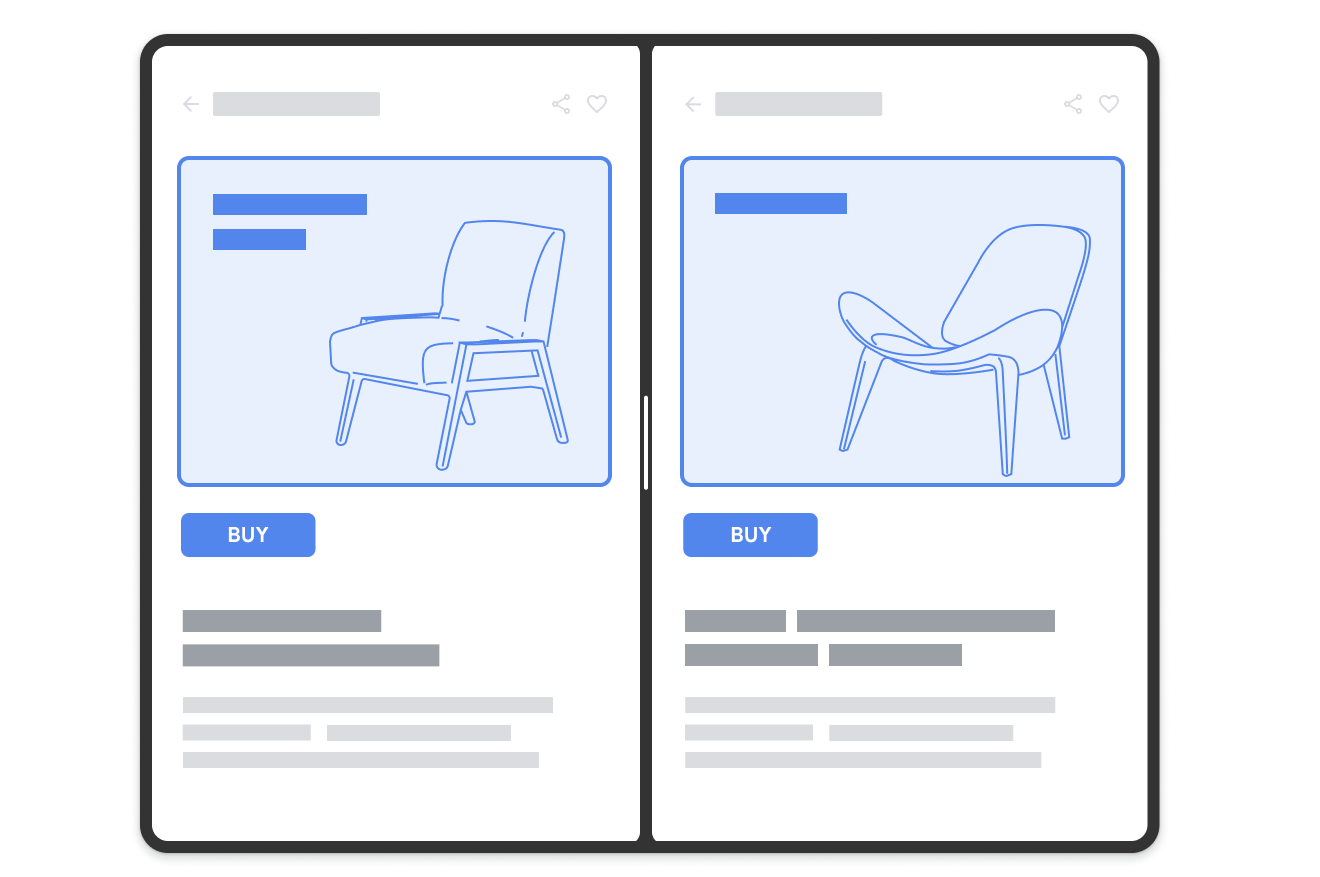
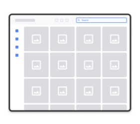
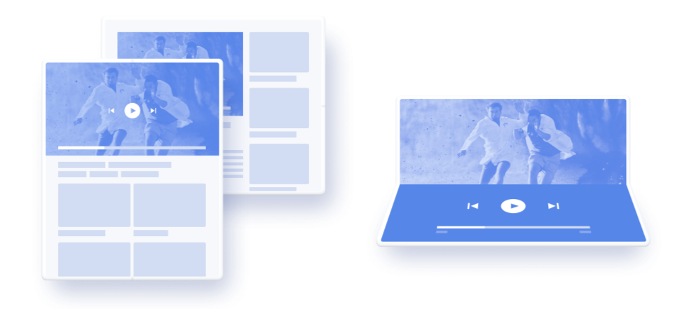
SlidingPaneLayoutOne of the most common adaptive layouts to optimize your app for large screens is implementing a list-detail UI. For example, a messaging app that lists messages on one side with the message detail on the other.
 |
| SlidingPaneLayout automatically adapts to configuration changes to provide a good user experience across different layout sizes. |
UIs that would be one top of each other on a smaller screen can now easily lay out side-by-side. For this, you can use the updated version of the SlidingPaneLayout library — updated to support a two-pane style layout, SlidingPaneLayout uses the width of the two panes to determine how to lay out the UI. It does that by automatically determining if it can lay out side-by-side based on the content width and available space. For example, if the list pane is measured to have a minimum width of 200dp and the detail pane needs 400dp, then the SlidingPaneLayout automatically shows the two panes side by side if it has at least 600dp of width available.
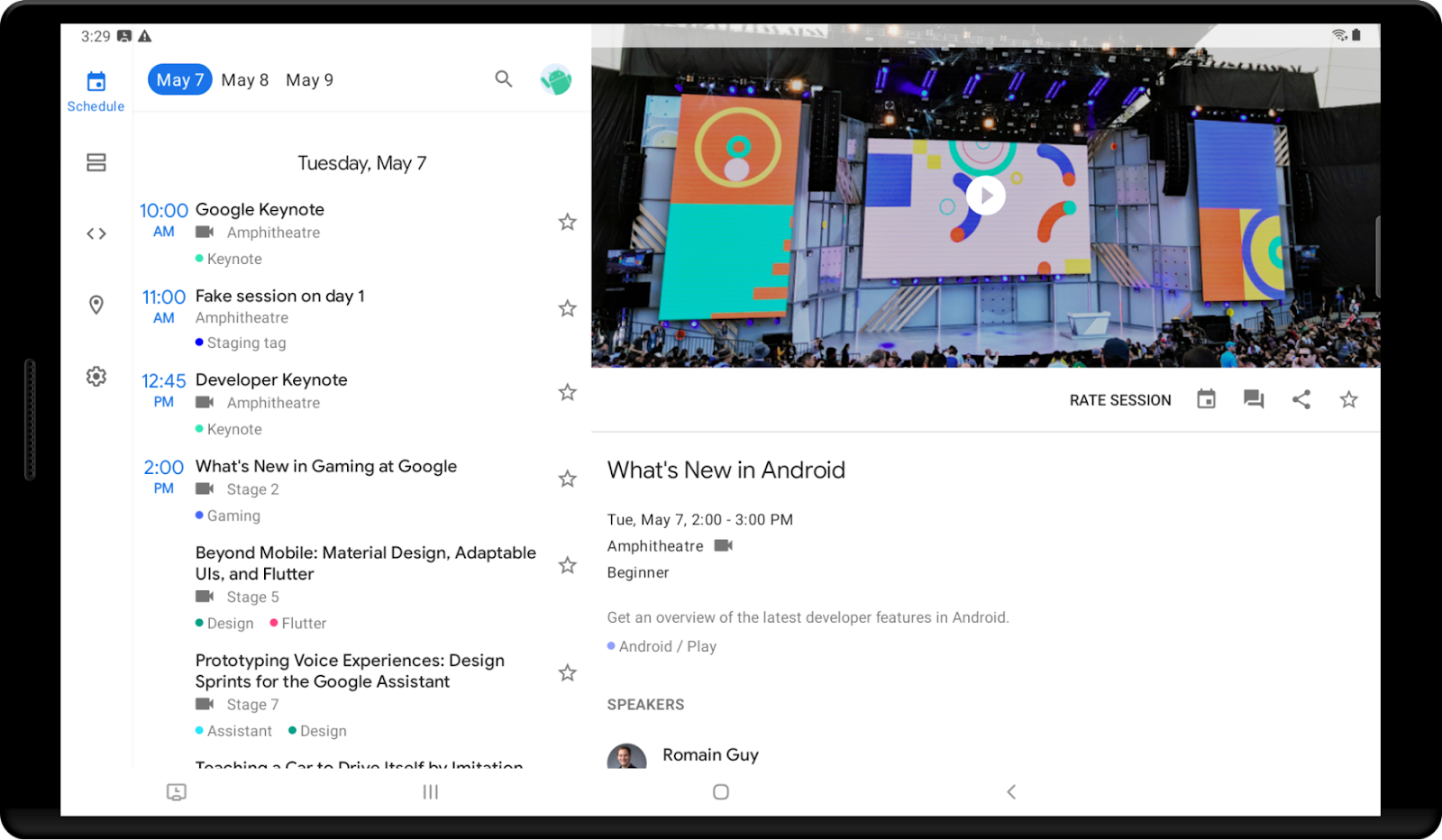 |
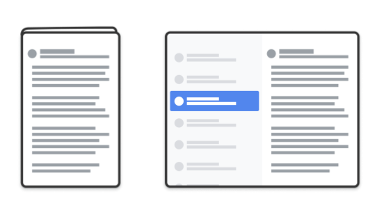
| SlidingPaneLayout is used in our sample application IOSched. |
We have updated the library to recognize and adapt to folds and hinges. For example, if you are on a device with hinges that blocks part of the screen, it will automatically place your content on either side.
We have also introduced lock modes, which allow control over the swipe behavior when panes overlap (programmatically switching is also supported). For example, to prevent users from swiping to an empty pane you may want them to have to click on a list item to load information about that pane, but allow them to swipe back to the list. On a foldable device or tablet that has room to show both views side by side, the lock modes are ignored.
NavRailA vertical Navigation Rail is functionally equivalent to Bottom navigation, and provides a more ergonomic navigation experience on larger screens. As you scale your UI, NavRail supports better reachability, since larger screens tend to be held by the side, whereas on the phone users are probably holding the device from the bottom.
 |
| NavRail automatically changes the location of the navigation menu depending on configuration changes. |
For example, NavRail can help if vertical scrolling is key to your app. In those cases, a bottom navigation bar decreases the amount of content that’s visible, especially when tablet devices are being used in landscape orientation.
Other ComponentsWe've also made updates across multiple other components. One of the biggest pitfalls when apps move to a larger screen is when UIs are stretched edge-to-edge across the whole screen. To help prevent this, we’ve added default Max Width values to certain Material Components where this commonly happens, for example:
- Buttons
- TextFields
- Sheets
We will add more components to this list in the future. These changes provide opinionated defaults to help your apps adapt and look better out of the box on large screen devices. Find more information about using size constraints with components in the Material Design guidelines.
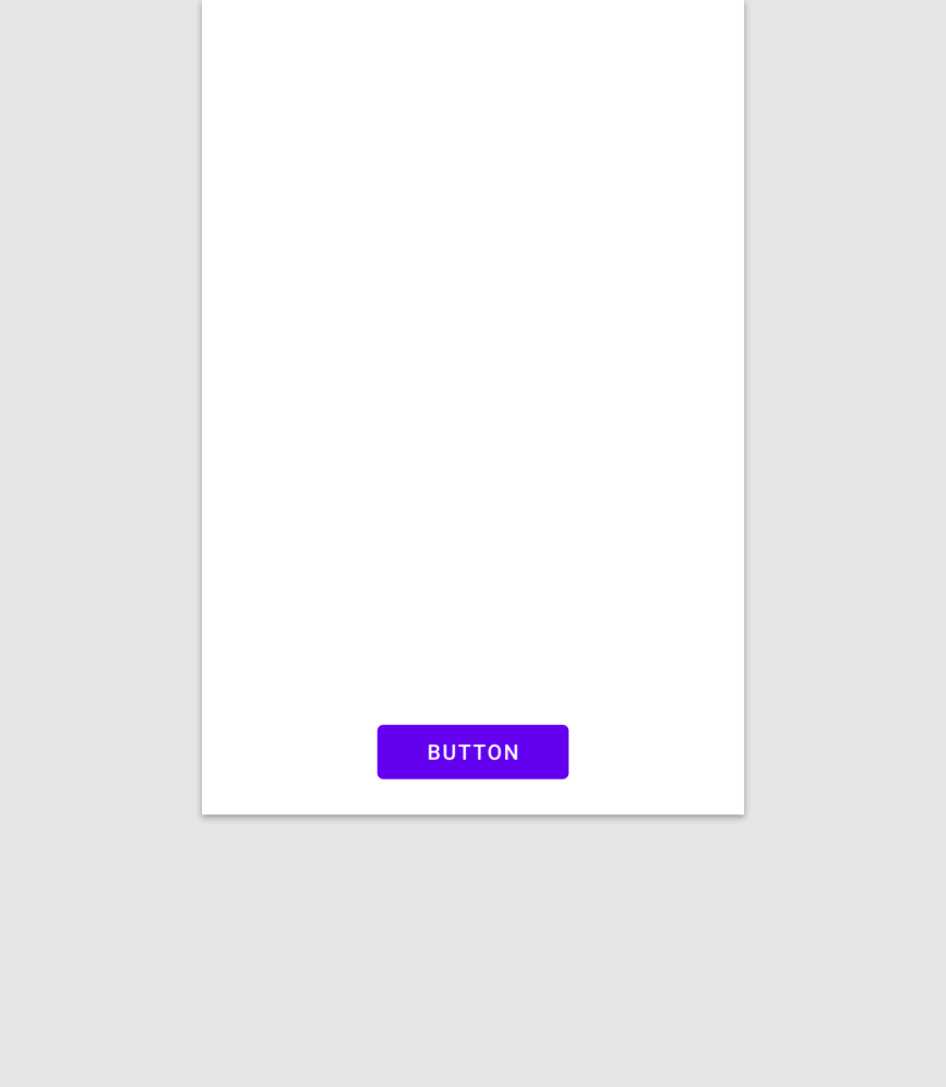 |
| Most foreground UI elements should have a maximum width value. |
Beyond component updates to help you scale your UI, we also have the WindowManager Jetpack library to help you build better experiences on these devices. This library is now available in alpha and it provides a common API surface for supporting different device types, starting with foldables and tablets.
You can use WindowManager to detect display features such as folds or hinges. It also gives information about how the display feature affects your app, so you can create an optimal experience. For example, reacting to the foldable device state changes when the device is folded into tabletop mode while the user is watching a video.
 |
| Applications should seamlessly adapt to a growing number of device configurations. |
WindowManager also provides a couple of convenience methods to retrieve the current and maximum WindowMetrics information in a backward compatible way, starting from API level 14.
Your app needs to determine the screen or display size in order to render content appropriately for each device. With the introduction of the WindowMetrics API, a number of methods related to display size have been deprecated. For a backwards-compatible replacement, you should use the Window Manager Jetpack library.
Exclusive resourcesAndroid 10 introduced the possibility to have multiple resumed apps running at the same time, with a single “top resumed” application. Most applications benefit from this change without the need of updates. The most notable exception is if your application uses an exclusive resource like the microphone or the camera. See our previous blog post for more details.
Optimizing your app for large screens can improve the experience for your users, as well as deliver on business results. We’re seeing an increased number of apps take advantage of the opportunities with large screens on Google Play. As an example, Google Duo implemented tablet and foldable support to enhance their user experience, and saw an increase in app ratings and user engagement.
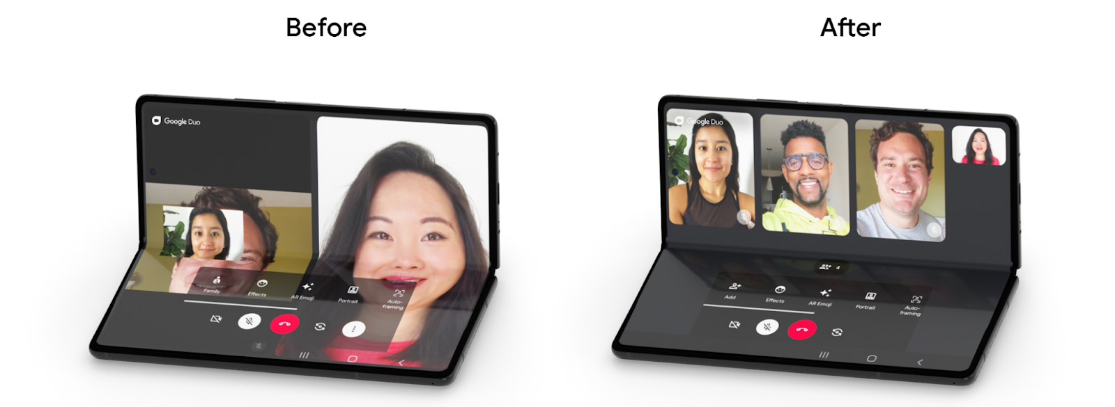 |
| Google Duo's optimized experience for foldable devices, such as the Samsung Galaxy Z Fold2 |
In addition to Google Duo's enhanced user experience, we've modernized many additional apps to use adaptive layouts so they can take advantage of large screens and foldable devices:
- Chrome added improved tab navigation for larger screens
- YouTube redesigned its UI to improve usability in foldable devices
- Google Photos displays more UI elements, like a search bar, in larger screens
- Google Calendar provides a more ergonomic UI in larger screens
To learn more about foldables and large screen devices, see the following resources:
Android Developers


 Google Play


