 ☰
🔍
☰
🔍
12 October 2021

Posted by Jeremy Walker, Developer Relations Engineer

At this year’s Google I/O, we announced we are bringing the best of Jetpack Compose to Wear OS. Well, today, Compose for Wear OS is in Developer Preview after a number of successful alpha releases.
Compose simplifies and accelerates UI development, and the same is true of Compose for Wear OS, with built-in support for Material You to help you create beautiful apps with less code.
In addition, what you’ve learned building mobile apps with Jetpack Compose translates directly to the Wear OS version. Just like mobile, you’re welcome to start testing it out right away, and we want to incorporate your feedback into the early iterations of the libraries before the beta release.
This article will review the main composables we've built and point you towards resources to get started using them.
Let's get started!
Most of the Wear related changes you make will be at the top architectural layers.

That means many of the dependencies you already use with Jetpack Compose don't change when targeting Wear OS. For example, the UI, Runtime, Compiler, and Animation dependencies will remain the same.
However, you will need to use the proper Wear OS Material, Navigation, and Foundation libraries which are different from the libraries you have used before in your mobile app.
Below is a comparison to help clarify the differences:
|
Wear OS Dependency (androidx.wear.*) |
Comparison |
Mobile Dependency (androidx.*) |
|
instead of |
androidx.compose.material:material ₁ |
|
|
instead of |
androidx.navigation:navigation-compose |
|
|
in addition to |
androidx.compose.foundation:foundation |
1. Developers can continue to use other material related libraries like material ripple and material icons extended with the Wear Compose Material library.
While it's technically possible to use the mobile dependencies on Wear OS, we always recommend using the wear-specific versions for the best experience.
Note: We will be adding more wear composables with future releases. If you feel any are missing, please let us know.
Here's an example build.gradle file:
// Example project in app/build.gradle file
dependencies {
    // Standard Compose dependencies...

    // Wear specific Compose Dependencies
    // Developer Preview starts with Alpha 07, with new releases coming soon.
    def wear_version = "1.0.0-alpha07"
    implementation "androidx.wear.compose:compose-material:$wear_version"
    implementation "androidx.wear.compose:compose-foundation:$wear_version"

    // For navigation within your app...
    implementation "androidx.wear.compose:compose-navigation:$wear_version"

    // Other dependencies...
}
After you've added the right Wear Material, Foundation, and Navigation dependencies, you are ready to get started.
Let's explore some composables you can start using today.
As a general rule, many of the Wear composables that are equivalent to the mobile versions can use the same code. The code for styling color, typography, and shapes with MaterialTheme is identical to mobile as well.
For example, to create a Wear OS button your code looks like this:
Button(
    modifier = Modifier.size(ButtonDefaults.LargeButtonSize),
    onClick = { /*...*/ },
    enabled = enabledState
) {
    Icon(
        painter = painterResource(id = R.drawable.ic_airplane),
        contentDescription = "phone",
        modifier = Modifier
            .size(24.dp)
            .wrapContentSize(align = Alignment.Center),
    )
}
The code above is very similar to the mobile side, but the library creates a Wear OS optimized version of the button, that is, a button circular in shape and sized by ButtonDefaults to follow Wear OS Material Guidelines.
Below are several composable examples from the library:
In addition, we've introduced many new composables that improve the Wear experience:
We also offer a wear optimized composable for lists, ScalingLazyColumn, which extends LazyColumn and adds scaling and transparency changes to better support round surfaces. You can see in the app below, the content shrinks and fades at the top and bottom of the screen to help readability:

If you look at the code, you can see it's the same as LazyColumn, just with a different name.
val scalingLazyListState: ScalingLazyListState =
    rememberScalingLazyListState()

ScalingLazyColumn(
    modifier = Modifier.fillMaxSize(),
    verticalArrangement = Arrangement.spacedBy(6.dp),
    state = scalingLazyListState,
) {
    items(messageList.size) { message ->
        Card(/*...*/) { /*...*/ }
    }

    item {
        Card(/*...*/) { /*...*/ }
    }
}
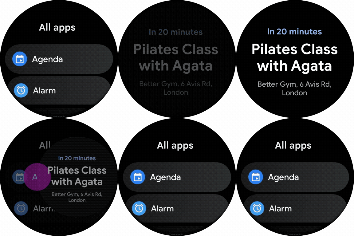
Wear has its own version of Box, SwipeToDismissBox, which adds support for the swipe-to-dismiss gesture (similar to the back button/gesture on mobile) out of the box.
Here's a simple example of the code:
// Requires state (different from Box).
val state = rememberSwipeToDismissBoxState()

SwipeToDismissBox(
    modifier = Modifier.fillMaxSize(),
    state = state
) { swipeBackgroundScreen ->

    // Can render a different composable in the background during swipe.
    if (swipeBackgroundScreen) {
        /* ... */
        Text(text = "Swiping Back Content")
    } else {
        /* ... */
        Text( text = "Main Content")
    }
}
Here's a more complex example of the behavior:

Finally, we also offer a Navigation composable, SwipeDismissableNavHost, which works just like NavHost on mobile but also supports the swipe-to-dismiss gesture out of the box (actually uses SwipeToDismissBox under the hood).
Here's an example (code):

Scaffold provides a layout structure to help you arrange screens in common patterns, just like mobile, but instead of an App Bar, FAB, or Drawer, it supports Wear specific layouts with top-level components like Time, Vignette, and the scroll/position indicator.
The code is very similar to what you would write on mobile.
We're excited to bring Jetpack Compose to Wear OS and make watch development faster and easier. To dive right in and create an app, check out our quick start guide. To see working examples (both simple and complex), have a look at our sample repo.
The Developer Preview is your opportunity to influence the APIs, so please share your feedback here or join the Slack #compose-wear channel and let us know there!