Android Developers Blog
The latest Android and Google Play news for app and game developers.
🔍
Platform Android Studio Google Play Jetpack Kotlin Docs News

24 Ağustos 2022

Wear OS Tiles Material Library: Build Tiles, Fast.


Link copied to clipboard

Posted by Anna Bernbaum, Product Manager, Ataul Munim, Developer Relations Engineer

We are excited to announce the launch of the Tiles Material library! Now, instead of building buttons, progress arcs and more from scratch, you can use our pre-built Material components and layouts to create tiles that embrace the latest Material design for Wear OS. You can use these together with the Tiles Design Kit to easily follow the Tiles Design Guidelines.

Tiles provide Wear OS users glanceable access to the information and actions they need in order to get things done quickly. They also are one of the most used surfaces on Wear OS. Just one swipe away from the watch face, users can quickly access the most important information or actions from an app, like starting a timer or getting the latest weather forecast.

animation showing the tiles experience on Wear OS. User swipes left from the watch face to see the first tile, and continues swiping to see others, including a fitness tile with buttons to initiate a workout, a music tile with chips to navigate to playlists, an alarm tile showing an upcoming alarm, among others.
Tiles carousel on Wear OS

We have built the following components for elements commonly used in tiles:
common tile components. a round icon with a pencil labelled "button". a full width rectangle with rounded corners and text labelled "chip". similar components, one larger and one smaller, labelled "title chip" and "compact chip" respectively. a circle path filled 75% clockwise labelled "circular progress indicator" and finally text labelled "text with recommended typography pre-set"

These components also make it faster to build tiles. For example, creating a button for your tile takes just a few lines of code:

val clickable: Clickable = generateClickable()

val button: Button = Button.Builder(this, clickable)
    .setIconContent("icon_exercise")

    .setContentDescription("Start workout")

    .build()


We have also created some predefined layouts to kickstart your tiles development. These already follow our design guidelines on how your tile layout should be formatted.
A calendar event tile with vertically stacked text details with an "open" action at the bottom, a weather tile showing a cloud icon, the current temperature and the day's high and low in a single row, a step counter tile with a progress indicator encircling the content and a timer tile with 5 buttons for different durations.

For example, we can build this tile using a predefined layout:
Tile with a PrimaryLayout, showing "Primary label text" at the top and "Action" as the primary chip at the bottom. The content slot is a MultiButtonLayout with 2 round icons , each with the plus sign.

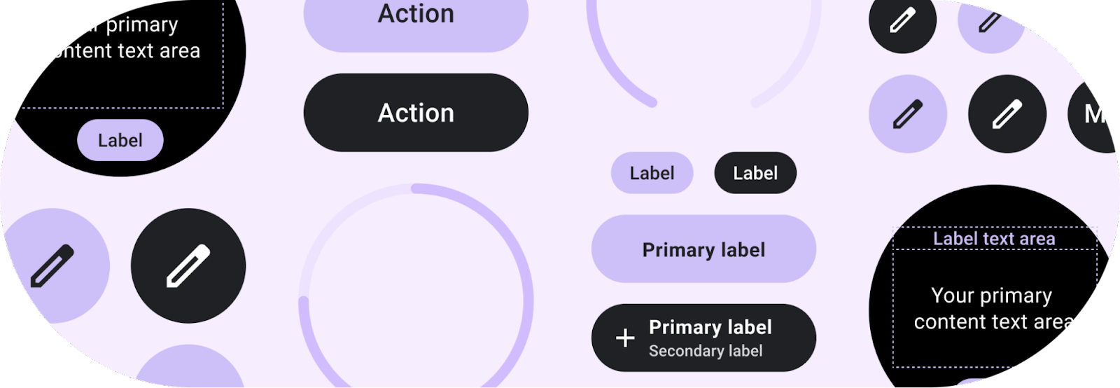
val theme = Colors(

    /*primary=*/ 0xFFD0BCFF.toInt(), /*onPrimary=*/ 0xFF381E72.toInt(),

    /*surface=*/ 0xFF202124.toInt(), /*onSurface=*/ 0xFFFFFFFF.toInt()

)

val buttonColors = ButtonColors.secondaryButtonColors(theme)

val chipColors = ChipColors.primaryChipColors(theme)

val timeline = Timeline.fromLayoutElement(
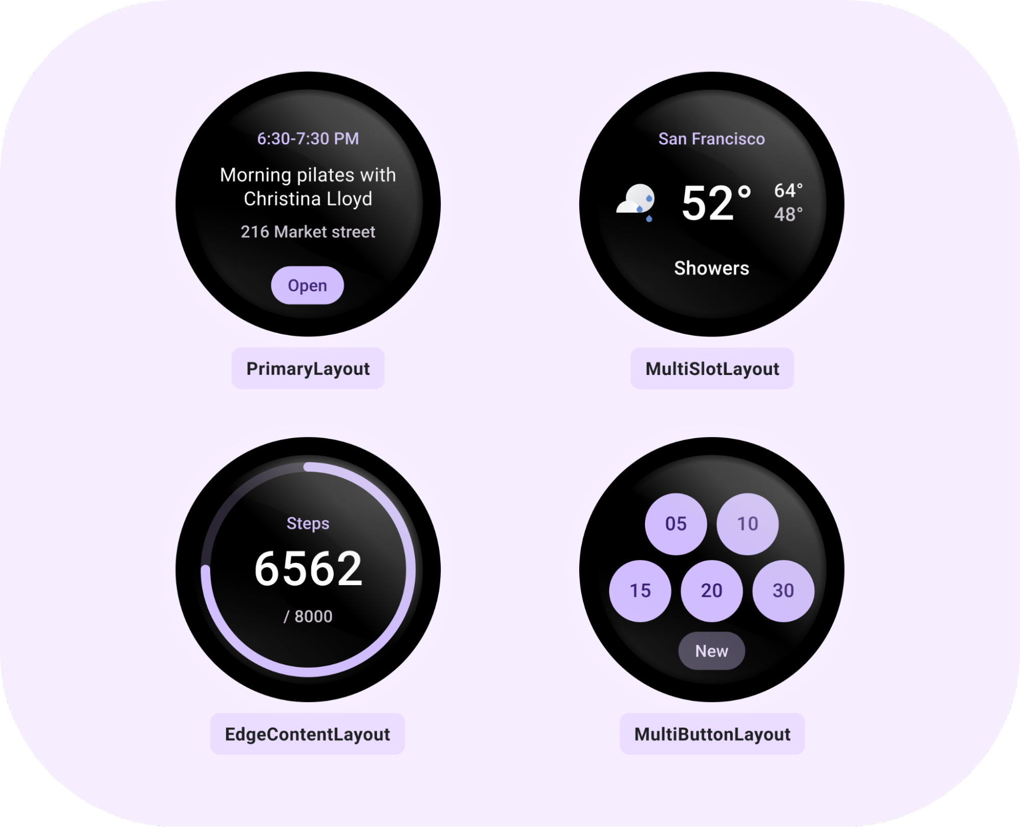
    PrimaryLayout.Builder(deviceParameters)

        .setPrimaryLabelTextContent(

            Text.Builder(this, "1 run this week")

                .setTypography(Typography.TYPOGRAPHY_CAPTION1)

                .setColor(argb(theme.primary))

                .build()

        )

        .setContent(

            MultiButtonLayout.Builder()

                .addButtonContent(

                    Button. Builder(this, clickable)

                        .setIconContent("icon_run")

                        .setButtonColors(buttonColors)

                        .setContentDescription("Run")

                        .build()

                )

                .addButtonContent(

                    Button.Builder(this, clickable )

                        .setIconContent("icon_yoga")

                        .setButtonColors(buttonColors)

                        .setContentDescription("Yoga")

                        .build()

                )
                .addButtonContent(

                    Button.Builder(this, clickable)

                        . setIconContent("icon_cycle")

                        .setButtonColors(buttonColors)

                        .setContentDescription("Cycle")

                        .build()

                )

                .build()

        )

        .setPrimaryChipContent(

            CompactChip.Builder(this, "More", clickable, deviceParameters)

                .setChipColors(chipColors)

                .build()

        )

        .build()

)


What's in the library

This library contains components and layouts that are in-line with Material guidelines and easy to use. The included components are:
  • Button - clickable, circular-shaped object, with either icon, text or image with three predefined sizes.
  • Chip - clickable, stadium-shaped object that can contain an icon, primary and secondary labels, and has fixed height and customizable width.
  • CompactChip & TitleChip - two variations of the standard Chip that have smaller and larger heights, respectively, and can contain one line of text.
  • CircularProgressIndicator - colored arc around the edge of the screen with the given start and end angles, which can describe a full or partial circle with the full progress arc behind it.
  • Text - styled text which uses the recommended Wear Material typography styles.
All these components have their own colors object that can be built with the main Colors class to easily apply the same theme over all components. In addition to colors, there is a Typography class to easily get FontStyle objects using the typography name.

In addition to components, there are recommended tile layouts:
  • PrimaryLayout - a layout which can be customized by adding primary or secondary labels, content in the middle, and a primary chip at the bottom. The main content within this layout could be added as a MultiSlotLayout or MultiButtonLayout object.
  • EdgeContentLayout - a layout for hosting CircularProgressIndicator around the edge with main content inside and primary or secondary label around it.
  • MultiButtonLayout - a layout that can contain between 1 - 7 buttons, arranged in line with the Material guidelines depending on their number.
  • MultiSlotLayout - a row-like style layout with horizontally aligned and spaced slots (for icons or other small content).
All layouts have recommended padding and styles applied that are within Material guidelines.


Tools for tiles

Android Studio Dolphin includes the Direct Surface Launch feature. This lets developers install and launch a tile directly from Android Studio, instead of having to manually add it from the tile selector on the target device. Get started with Direct Surface Launch by creating a new Run Configuration and selecting Wear OS Tile, then choosing the module and TileService class.

Horologist Tiles is also recommended to save time during tile development. This library gives you the ability to preview a tile UI straight from Android Studio, making the write-test loop a lot shorter. Horologist Tiles also includes Kotlin friendly abstractions, like CoroutinesTileService so you can use what you're already familiar with.


Get started with Tiles Material

For a quick start, take a look at the new Tiles codelab, the code sample and the docs.

Please share your feedback on the issue tracker and let us know what you think of Tiles Material!