 ☰
🔍
☰
🔍
 ☰
🔍
☰
🔍
20 October 2022
Posted by James Williams, Developer Relations Engineer

The latest releases of Material Design Components (MDC) - 1.7.0 brings updates to Material You styling, accessibility and size coherence and new minimum version requirements
MDC 1.7.0 has new minimum version requirements:
This is a fairly large jump in terms of the Gradle plugin version, so make sure to secure changes in your build files first before moving on to UI code. As always, our release notes contain the full details of what has been updated. There are a couple standout updates we’d like to highlight.
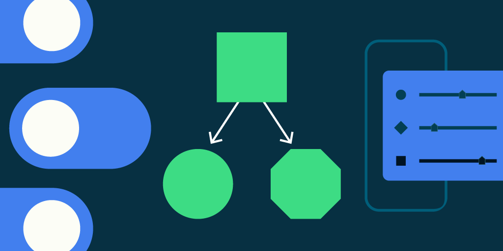
The Switch component has undergone a visual refresh that increases contrast and accessibility. The MaterialSwitch class replaces the previous SwitchMaterial class.
It now differentiates between the on and off states more by making the “on” thumb larger and able to contain an icon in addition to an on state color. The “off” state has a smaller thumb with less contrast.

Much of the new component’s core API aligns with the obsolete SwitchMaterial class so to get started, you can simply replace the class references.
For more information on how the obsolete component stacks against the new implementation, check the documentation on GitHub.
A component’s shape is one way to express your brand. In addition to providing a custom MaterialShapeDrawable, there is also a means to more simply customize shape theming using rounded or cut corners.
Material 3 components have been updated to apply one of the seven styles ranging from None to Full. A component’s shape is defined by two properties: its Shape family, either rounded or cut, and its value, usually described in dp. Where a “none” style always results in a rectangular shape, the resulting shape for full depends on the shape family. Rounded returns a rectangle with fully rounded edges, while Cut returns a hexagonal shape.
You are able to set the shape family and value individually and arbitrarily on each edge but there are set intervals and baseline values.
 |
The Shape Theming card in the Catalog app allows you to see how different values affect rounded or cut corners.
We’re fast at work on the next major version of MDC. You can follow the progress, file bug reports and feature requests on GitHub. Also feel free to reach out to us on Twitter @materialdesign.
Android Developers


 Google Play


