 ☰
🔍
☰
🔍
13 October 2022
Posted by Allison Chang (Product Manager, Google Play), Weifang Sun (Product Manager, Chrome OS), Manuel Wang (Product Manager, Google Play Console), and Marcus Leal (Product Manager, Google Play)
Your Play Store listing is the best way to help prospective users understand the functionality and value of your app. The assets and information you provide - descriptions, images, and videos – are essential to users looking to make a decision on what to download. |
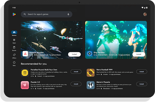
| Play Store homepage for large screens (2023) |
 |
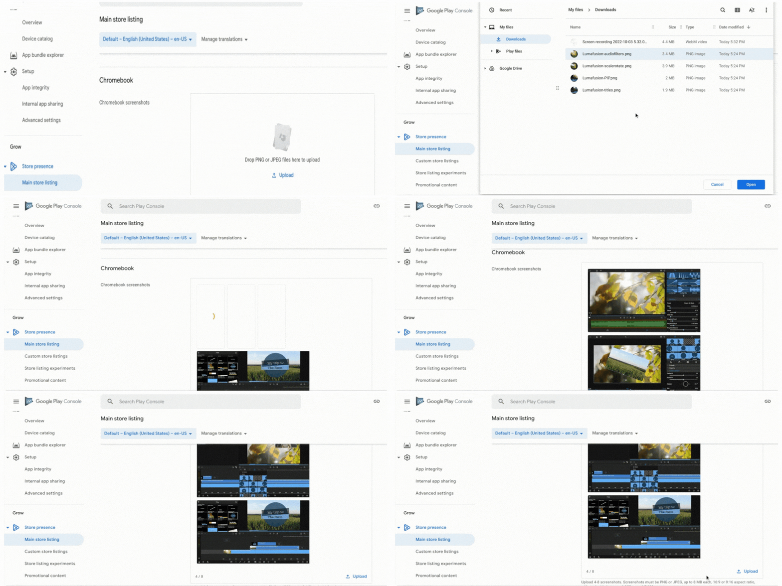
| Chromebook screenshots in Play Developer Console |
This will allow up to 8 screenshots and will be shown primarily on the Play Store for Chromebooks. These screenshots will appear on both your app listing page and Play homepages.
We recommend using 16:9 screenshots for landscape with dimensions of 1080-7690px.
To get started, visit the Main Store Listing section in Play Console.
Updates to Tablet Screenshot Guidelines
With the new launch of ChromeOS screenshot support, we’re also updating our quality guidelines for tablets for consistency across large screens. While previously uploaded tablet screenshots will not be affected, this should help simplify the process of generating new screenshots when you make updates to your app. |
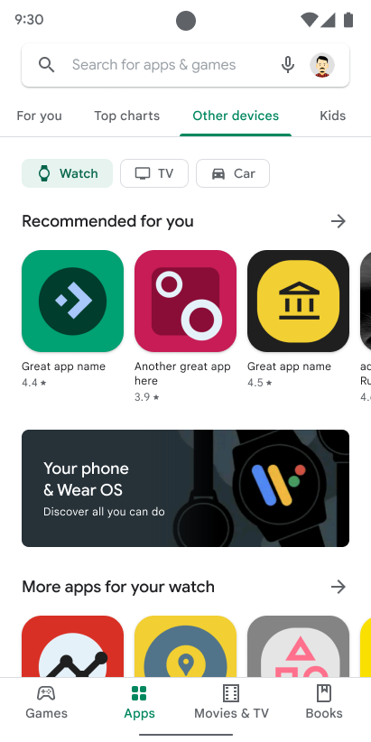
| Homepages for other devices |
Search Device Filters and Remote Install
Users can also filter results in search with a new device filter in Play. With the filter enabled, search results will only include titles that are compatible with the selected device.
Since these changes will make your store listing details much more prominent in Play, here are some ways to help you optimize your app assets:
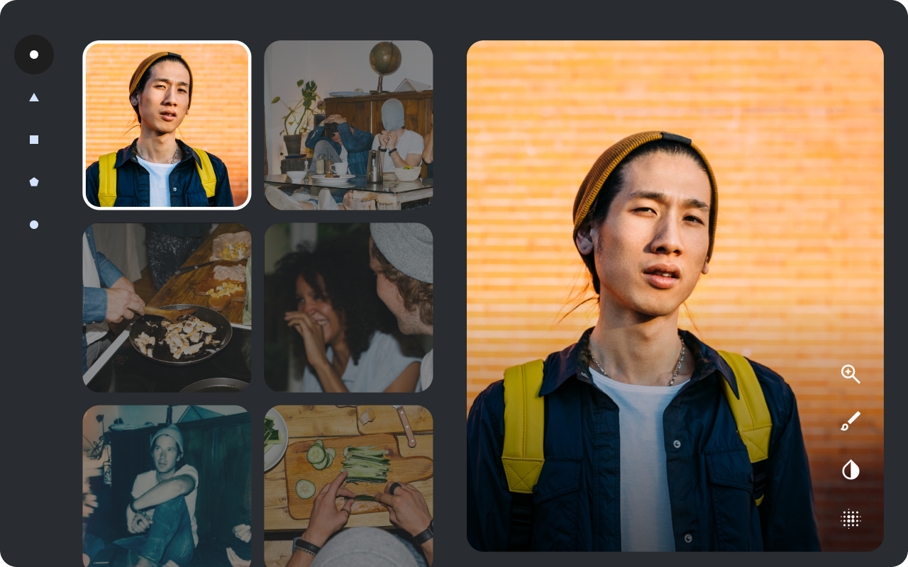
Use device-specific screenshots that demonstrate the core app or game experience.
In Play Console, you can upload screenshots to show users how your app or game will look on different device types and highlight unique form factor features. When choosing screenshots, use imagery that conveys the primary user flows within your app. This will help users on all devices anticipate what the true app or game experience will be like for them.
 |
Use device imagery with caution
Showing a physical device in your store listing may cause your screenshots and videos to become obsolete quickly or alienate some users. To save time maintaining your assets, use screenshots and videos of just the app or game experience.
Use high-quality images with the proper aspect ratio and resolution
Using high quality images is essential to ensuring your screenshots look great on all screen sizes. Don’t include screenshots that are pixelated, stretched or compressed, or improperly rotated.
 |
 |
Avoid overloading assets with text
To make sure your screenshots and videos look great when featured on Play homepages, avoid using too much text. Since we may resize your assets to fit certain screen sizes, this will prevent any text from being cut off unintentionally.
If you need to use text, avoid any time-sensitive copy that needs to be updated frequently.
 |
As we continue to test ways to feature your store listing information more prominently in Play, the quality of your assets remain as important as ever. We hope these features and tips empower you to showcase the best of your app on all device types. For more tips like these to help you get started, visit our content quality guidelines.