 ☰
🔍
☰
🔍
13 March 2023

Kakaonavi prides itself on providing fast, accurate routes while offering several other helpful features, including directions to the nearest EV charging stations, car wash order services, navigation data, maintenance reminders, and more. As Korea’s top ranking driving assistant, Kakaonavi wants to make the daily driving experience as easy as possible for its users. Recently, that meant making its services consistent across devices.
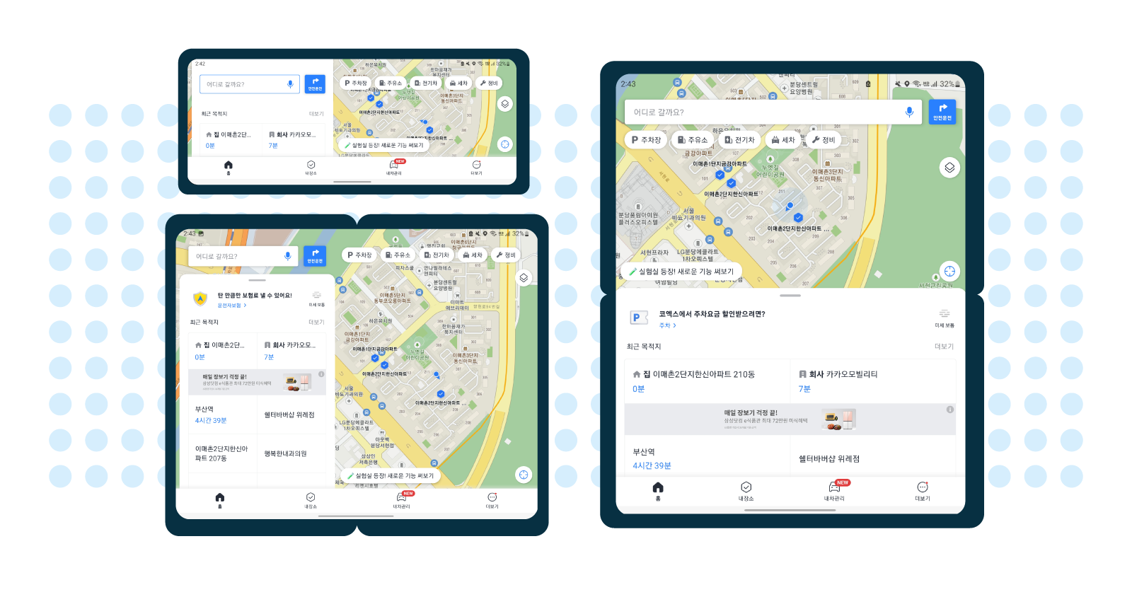
With an increasing number of people using large screen and foldable Android devices, Kakaonavi saw a need to evolve its application to optimize the driving experience across all screen shapes and sizes. To do this, the Kakaonavi team focused on establishing a high-quality user experience for large screens by using Android’s latest software features.
Before updating its app, Kakaonavi’s user experience wasn’t tailored for large screens and foldables. The different sizes of devices caused the UI to be displayed improperly on them, which affected the user experience because screen ratio and resolution have a significant impact on usability.
 Additionally, some drivers, including professionals like truck drivers and taxi drivers, use Kakaonavi with three to four other apps simultaneously through Android OS’s split-screen mode. At the time, the Kakaonavi team had only established this type of multi-window supportfor devices with standard resolutions, leading to some of its users experiencing UI issues when trying to run multiple applications at once. Additionally, some drivers, including professionals like truck drivers and taxi drivers, use Kakaonavi with three to four other apps simultaneously through Android OS’s split-screen mode. At the time, the Kakaonavi team had only established this type of multi-window supportfor devices with standard resolutions, leading to some of its users experiencing UI issues when trying to run multiple applications at once. |
Developers at Kakaonavi addressed these issues by creating a common UI for large screen and foldable devices. They needed to ensure the UI was consistent whether the device was folded or unfolded, or in portrait or landscape mode. The UI also had to work efficiently while users ran multiple apps on their device’s main display. Because the ability to display map and location information on a larger screen is one of the benefits of these devices, creating consistency across layouts was essential to Kakaonavi’s success.
Using ConstraintLayout, which lets developers create large, complex layouts with a flatter app structure, the Kakaonavi team displayed a uniform, responsive UI regardless of the screen size or ratio. To handle configuration changes that are common on these devices, such as resizing windows or orientation changes, Kakaonavi's developers overrode onConfigurationChanged().
Overriding onConfigurationChanged() ensured the app ran smoothly on all screen sizes and during view mode changes by preventing the system from recreating UI elements triggered by folding and unfolding a device or opening multiple windows. Manually configuring these changes to preserve UI elements, rather than automatically deleting and recreating them, drastically improved the app’s UI performance for these new form factors.
“Since the map and UI state are updated frequently by GPS, we decided that the app would perform better by responding only to changes in screen orientation and screen size with onConfigurationChanged(), rather than restoring the previous state by restarting the Activity,” said Jaesun.
The Kakaonavi team also used multi-resume to enhance the app’s multi-window support for large screens and foldables. Multi-resume lets its users keep multiple applications in an active state while on screen, making multitasking more convenient and reliable.
 |
The number of people using large screen and foldable devices has grown significantly and will continue to grow as more of these devices become available. Currently, there are more than 270 million large screen Android devices in use, including tablets, foldables, and Chrome OS devices.
Kakaonavi has seen this same trend in devices used by its consumers. Since the brand began optimizing its application for large screens in January 2022, its number of monthly active users who use the app on foldables has increased by 24.5%, and the company has received positive feedback from drivers using tablets and foldables as their main source of navigation. As of today, Kakaonavi is optimized for all available tablets and foldables.
The Kakaonavi team is excited by the opportunities these new form factors will bring by giving its users more ways to interact with the app. Looking ahead, the brand plans to further optimize its UI with Jetpack Compose and is already considering how to further tailor its multi-window support to large screens and foldables.
“There will be more devices with various screen sizes and ratios in the future,” said Jaesun. “That’s why we believe it’s important to always provide an optimized UI and meet the needs of consumers’ frequently changing screens.”
Learn how you can optimize your application for large screens and upcoming form factors.