 ☰
🔍
☰
🔍
22 Haziran 2023
 Posted by the Android team

Available in 180 countries and with over 1 billion downloads on Google Play, Dropbox is one of the world’s most popular file sharing and cloud storage services. Dropbox is on a mission to design a more enlightened way of working, keeping life organized and work moving. Recently that meant Jetpack Compose , Android’s modern declarative toolkit for creating native UI.

Since adopting Compose, Dropbox developers have rewritten many features for the app, including its home screen, file preview, and search experiences. Dropbox’s search experience was completely rebuilt in just a few weeks, which was 40% less time than expected and less than half the time it took them to build the same feature for iOS.
The team being able to work faster was a direct result of how simple it was for them to use Compose. Since rebuilding the search experience, Dropbox developers have seen a 13% increase in successful search sessions —a key metric for the team.
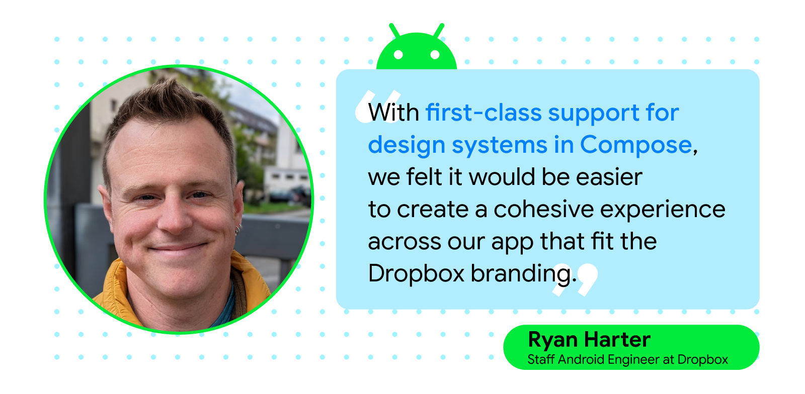
Compose helped Dropbox developers move quickly, letting them easily build complex, custom UIs with the toolkit’s basic building blocks and utilities. “Support for multiple previews, with different configurations or data, allows us to consider different variations of components as we build them instead of as an afterthought,” said Ryan Harter, staff Android engineer at Dropbox.
The Dropbox team also built a new design system on top of Android’s MaterialTheme, which the engineers accomplished by following Compose best practices. Creating the new design system on top of Android’s MaterialTheme minimized the time it took for Dropbox developers to lay the app’s foundation, allowing them to build new features with Compose while maintaining a look and feel that’s consistent with Dropbox’s branding.
Dropbox developers were also swayed to use Compose thanks to its interoperability with Views and were impressed by how easy it was to develop in tandem with both toolkits. The Dropbox team was able to support classic Views libraries and plugins within the app while creating new UI components using Compose. Because of this, Dropbox developers could gradually migrate the app to Compose instead of completely overhauling the app.
“Interoperability with Compose allowed us to move forward with the toolkit, even when we needed to interact with Views in certain workflows such as ExoPlayer and PDF document views,” continued Ryan. “You can start with a smaller component and experience the benefits and improved speed without committing to rewriting your entire app. It’s clear that Compose was designed with the intention that users don’t need to perform an all-or-nothing migration.”
During their rewrites, Dropbox engineers found that Compose made developing easier and enabled more efficient testing. “Compose, together with Android Studio’s preview support, has allowed us to iterate on features faster by reducing the length of the feedback cycle while developing screens,” continued Ryan.
The fast feedback cycle and interactive previews from Compose allowed the Dropbox team to experiment with UX quickly and test any assumptions they had about the updates, which made it easier to release features.
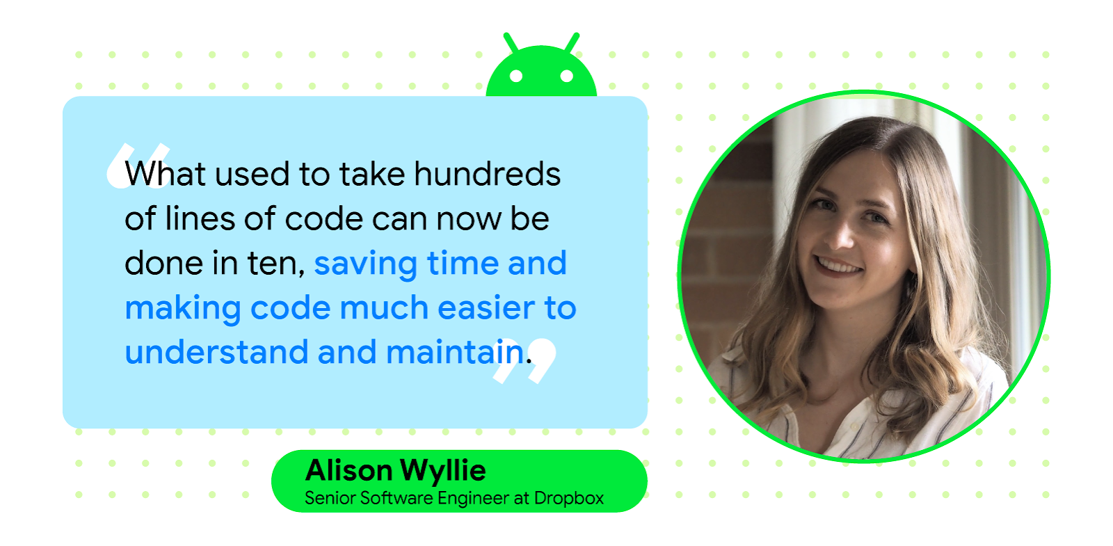
“If questions came up about performance or use of an approach, we went into Android Studio and used the interactive previews to test and measure results so we’d have more answers and fewer assumptions,” said Alison Wyllie, a senior software engineer at Dropbox. “And the fast feedback cycle and interactive previews that come with Compose have allowed us to experiment quickly with UX and test our assumptions, allowing us to get features into users’ hands faster.”
Jetpack Compose’s push toward a unidirectional data flow (UDF) also helped Dropbox engineers while testing and debugging. Combining UDF with Compose testing libraries and the toolkit’s declarative approach to creating UI made the Dropbox team confident that the app’s features were stable and bug free because they could fully test them before release.

Dropbox’s engineers were impressed by the ease and speed with which they could iterate and get feedback using Compose. With interactive and on-device previews, Compose allows for experimentation and development in ways that weren’t previously possible for the team at Dropbox. The Dropbox team plans to continue building the app’s design system using Compose and expects most new features to be written with the toolkit.
“Compose gave us a fresh start with a lot of key areas that have historically been difficult for Android engineers. I’m very excited to see what new functionality Google and the open source community will create next,” said Allison.
Optimize your UI development with Jetpack Compose.