 ☰
🔍
☰
🔍
25 Temmuz 2023
 Posted by Allison Chang, Product Manager, Google Play

Last year at Google I/O, we shared some big changes coming to the Play Store for large screen devices. Since then, we’ve seen even more people using large screens for work and play, across millions of active Android devices. Apps and games play a critical role in shaping the on-device experience, so we’ve redesigned the Play Store to help users get the most from their tablets, Chromebooks, and foldables.
Today, we’re introducing four major updates to help users find high-quality large screen apps on Play: refreshed app listing pages, ranking and quality improvements, streamlined store navigation, and a split-screen search experience.
Your store listing page is the best way to demonstrate the functionality and value of your app, so we’ve revamped the experience to put your content front and center. Games with high-quality videos will show a video banner at the top of their app listing page, allowing users to get a sense of gameplay in an immersive way. We've also reorganized apps and games details pages in a multi-column layout, bringing more of your content higher up the page.
To promote high-quality apps that shine on large screens, we’ve made several ranking changes to boost quality across Play. Apps and games that adhere to our large screen app quality guidelines will now be ranked higher in search and Apps and Games Home. This helps users find apps that resize well, aren't letterboxed, and support both portrait and landscape orientations. Editors’ Choice and other curated collections and articles will also consider these criteria going forward, creating new featuring opportunities for optimized apps.
Last year, we also announced app listing warnings and reduced visibility for apps and games that do not meet Play’s per-device technical quality bar. This extends our phone technical quality requirements for phones to large screens, and affects apps and games with an 8% user-perceived crash rate or 8% user-perceived ANR rate on the user’s device.
These warnings will appear on your app details page, with the goal of setting user expectations for how apps will look and function on their devices. We’ll begin rolling out these changes in late August, so there’s still time to use Android vitals in Play Console or the reporting API to monitor and improve your app’s stability metrics.
Finally, to help users better understand the in-app experience up front, we are increasingly featuring your store listing assets directly on Apps and Games Home.
New content forward formats will use form factor specific screenshots, videos, and descriptions to display a preview of the app experience and help users make install decisions. As part of this change, apps with large screen assets that follow our content quality guidelines can take advantage of these richer formats, and will occupy more screen real estate on Play homepages. As you audit your large screen assets, here are some best practices to help your app stand out:
For more tips and guidelines to building high quality apps, visit our quality hub.
For more seamless browsing, we’ve simplified our store navigation and moved to a left-side navigation rail on larger screens. This puts menu items closer to users’ thumbs and makes them more accessible, especially when holding a device in landscape mode.
We’ve also made certain aspects of the store easier to find to help users discover useful and popular apps. For example, we’ve moved the Top Charts and Categories sections to Apps and Games Home. On tablets and Chromebooks, we’ve made the Kids experience a primary tab, since these devices are often shared with children.
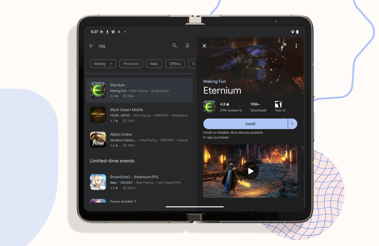
Lastly, we’re excited to announce a new search experience that makes it easy to discover and compare apps from within the search results page.
We’re launching a split-screen search experience on large screens, displaying search results and app details pages side by side. This prevents users from switching back and forth when exploring new apps and streamlines the discovery process.
These changes will begin rolling out over the coming weeks, and are just the beginning of our journey in creating a tailored Play Store experience for large screens. For more inspiration and examples of high-quality large screen apps, visit our app design gallery or check out our recent session on app quality from Google I/O.