 ☰
🔍
☰
🔍
11 July 2024
 Posted by Maru Ahues Bouza – Product Management Director, Android Developer

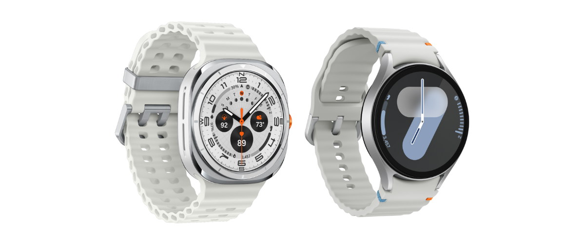
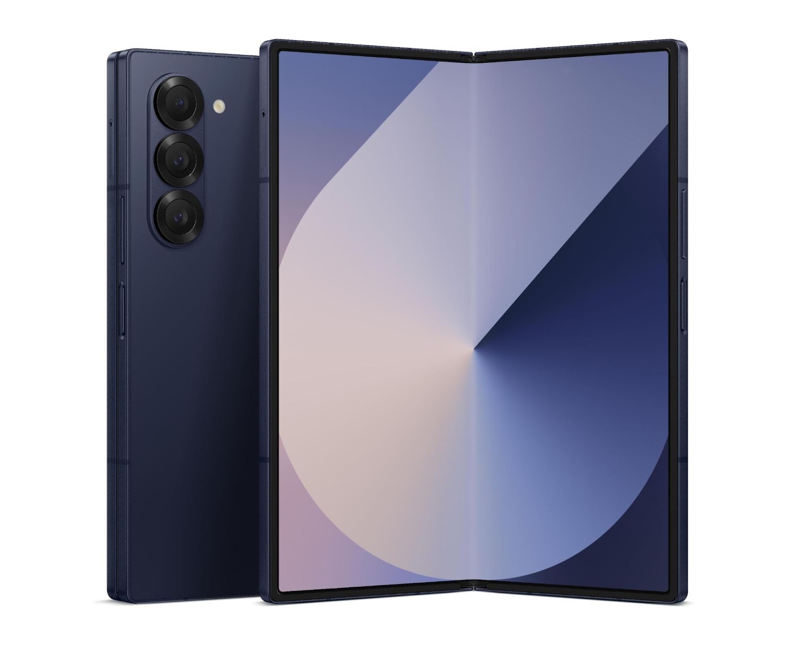
Yesterday’s Galaxy Unpacked event from Samsung debuted the latest in foldables, wearables, and more! The event introduced the Galaxy Z Fold6 and Z Flip6 and the Galaxy Watch7 and Watch Ultra - and it has never been easier to build apps that look great across all these screen sizes and types. To help you get your apps ready for the latest Android devices, we’re sharing how you can prepare your app for Wear OS 5 and how to build adaptive apps that scale across mobile, tablets, foldables and more!
Samsung’s new Galaxy Watch lineup, including the Watch Ultra and Watch7, will be the first smartwatches powered by Wear OS 5, the latest version of the Wear OS platform. As Wear OS 5 is based on Android 14, this new platform version brings with it a number of developer-facing changes. To ensure your app is ready for the next generation of devices, start by testing your app on the Wear OS 5 Emulator!

Wear OS 5 brings the next iteration of the Watch Face Format, providing more features to create expressive, efficient and individual watch faces for your users. New watches launched with Wear OS 5 will only support third-party watch faces built with Watch Face Format, prioritizing the user experience. For more information on watch face compatibility, see this Help Center article.
As we gather momentum behind the Watch Face Format, we’re changing requirements for publishing watch faces on Google Play. Check out the watch face page for the latest guidance.
The latest in large screens and foldables are here, with the new Galaxy Z Fold6 and Z Flip6, so there is even more reason to ensure your app looks great across whatever screen size or folded state your users are engaging with. The best way to do that is to make your app adaptive - meaning your users get an optimal experience on all their devices. By building an adaptive app, you scale across mobile, tablets, foldables, desktop and more.

A great place to start when building adaptive apps is with the new Compose adaptive layout libraries. These libraries are designed to help you to make your UI look good across window sizes. From navigation UI to list/detail and supporting pane layouts, we’re providing composables to make building an adaptive app easier than ever.
Additionally, window size classes are the best way to scale your UI, with opinionated breakpoints that help you design, develop, and test responsive/adaptive layouts across various window sizes. Window size classes enable you to change your app layout as the display space available to your app changes, for example, when a device folds or unfolds, the device orientation changes, or the app window is resized in multi‑window mode.
Discover everything you need to know about building adaptive apps with the adaptive apps documentation; it will be continually updated with the latest and greatest tools and APIs to enable you to scale across screens!
With these new devices, from the smallest to the largest, there are opportunities to build apps that excite your users on all their favorite Android screens. Apps like SoundCloud, Peloton, and more are already building experiences that scale across their user’s favorite screens!
Get building for Wear OS today by checking out Wear OS developer site and visiting the Wear OS gallery for inspiration. And scale your app across even more screens by building adaptive with the latest from Compose!