 ☰
🔍
☰
🔍
23 January 2025
 Posted by Maru Ahues Bouza – Director, Product Management

With 3+ billion Android devices in use globally, the Android ecosystem is more vibrant than ever. Android mobile apps run on a diverse range of devices, from phones and foldables to tablets, Chromebooks, cars, and most recently XR. Users buy into an entire device ecosystem and expect their apps to work across all devices. To thrive in this multi-device environment, your apps need to adapt seamlessly to different screen sizes and form factors.
Many Android apps rely on user interface approaches that work in a single orientation and/or restrict resizability. However, users want apps to make full use of their large screens, so Android device manufacturers added well-received features that override these app restrictions.
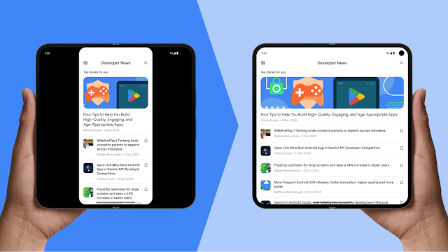
With this in mind, Android 16 is removing the ability for apps to restrict orientation and resizability at the platform level, and shifting to a consistent model of adaptive apps that seamlessly adjust to different screen sizes and orientations. This change will reduce fragmentation with behavior that better meets user expectations, and improves accessibility by respecting the user’s preferred orientation. We're building tools, libraries, and platform APIs to help you do this to provide a consistently excellent user experience across the entire Android ecosystem.
Starting with Android 16, we're phasing out manifest attributes and runtime APIs used to restrict an app's orientation and resizability, enabling better user experiences for many apps across devices.
These changes will initially apply when the app is running on a large screen, where “large screen” means that the smaller dimension of the display is greater than or equal to 600dp. This includes:
The following manifest attributes and APIs will be ignored for apps targeting Android 16 (SDK 36) on large screens:
| Manifest attributes/API | Ignored values |
| screenOrientation | portrait, reversePortrait, sensorPortrait, userPortrait, landscape, reverseLandscape, sensorLandscape, userLandscape |
| setRequestedOrientation() | portrait, reversePortrait, sensorPortrait, userPortrait, landscape, reverseLandscape, sensorLandscape, userLandscape |
| resizeableActivity | all |
| minAspectRatio | all |
| maxAspectRatio | all |
There are some exceptions to these changes for controlling orientation, aspect ratio, and resizability:
Also, users have control. They can explicitly opt-in to using the app’s default behavior in the aspect ratio settings.

Apps will need to support landscape and portrait layouts for window sizes in the full range of aspect ratios that users can choose to use apps in, as there will no longer be a way to restrict the aspect ratio and orientation to portrait or to landscape.
To test if your app will be impacted by these changes, use the Android 16 Beta 1 developer preview with the Pixel Tablet and Pixel Fold series emulators in Android Studio, and either set targetSdkPreview = “Baklava” or use the app compatibility framework by enabling the UNIVERSAL_RESIZABLE_BY_DEFAULT flag.
For existing apps that restrict orientation and aspect ratio, these changes may result in problems like overlapping layouts. To solve these issues and meet user expectations, our vision is that apps are built to be adaptive, to provide an optimal experience whether someone is using the app on a phone, foldable, tablet, Chromebook, XR or in a car.
To account for different window sizes and aspect ratios, use window size classes to drive layout behavior in a way that doesn’t require device-specific customizations. Apps should also be built with the assumption that window sizes will frequently change. It’s not necessary to build duplicate orientation-specific layouts - instead, ensure your existing UIs can re-layout well no matter what the window size is. If you have a landscape- or portrait-specific layout, those layouts will still be used.
If you're already building adaptive layouts and supporting all orientations, you're set up for success as your app will be prepared for each of the device types and windowing modes your users want to use your app in and these changes should have minimal impact.
We've also got a range of testing resources to help you guarantee reliability. You can automate testing with tools like the Espresso testing framework and Jetpack Compose testing APIs.
FlipaClip is a great example of why building for multiple form-factors matters: they saw 54% growth in tablet users in the four months after they optimized their app to be adaptive.
We understand that the changes are significant for apps that have traditionally only supported portrait orientation. UI issues like buttons going off screen, overlapping content, or screens with camera viewfinders may need adjustments.
To help you plan ahead and make the necessary adjustments, here’s the planned timeline outlining when these changes will take effect:
| Target API level | Applicable devices | Developer opt-out allowed |
| 36 (Android 16) | Large screen devices (smallest screen width >600dp) | Yes |
| 37 (Anticipated) | Large screen devices (smallest screen width >600dp) | No |
The deadlines for targeting a specific API level are app store specific. For Google Play, the plan is that targeting API 36 will be required in August 2026 and targeting API 37 will be required in August 2027.
Refer to the Android 16 changes page for all changes impacting apps in Android 16, as well as additional resources for updating your apps if you are impacted. To test your app, download the Android 16 Beta 1 developer preview and update to targetSdkPreview = “Baklava” or use the app compatibility framework to enable specific changes.
We're committed to helping developers embrace this new era of adaptive apps and unlock the full potential of their apps across the diverse Android ecosystem. Check out the do’s and don’ts for designing and building across multiple window sizes and form factors, as well how to test across the variety of devices that your app will be used in.
Stay tuned for more updates and resources as we approach the release of Android 16!