 ☰
🔍
☰
🔍
27 juin 2023
 Posted by Alex Vanyo, Developer Relations Engineer

With the increase in Android apps being used on large screen form factors like foldables and tablets, more and more apps are building fully adaptive UIs. See Support different screen sizes for best practices for updating your app for best practices for updating your app. The bottom line is that Layout and app behavior should be based on device configuration and available features, and not the physical type of the device.
At the same time, we get this question a lot: “Is there an easy way to tell if a device is a foldable, tablet, or something else?”
It might seem that using the physical type of device provides all the information developers need to create great experiences. However, we can make more adaptive apps with a better user experience by adding more context. For example:
- Do you want “flip”-style phones to count as foldables?
- Do you want to determine if a device is a tablet, or just if cellular functionality is available?
- What would rollables count as? What about ChromeOS devices, or other desktop devices that can run Android apps?
The most common reason app developers want to know the type of the device is so they can determine what kind of layout to show. But with the increase of split-screen and multi-window usage on large screens, making layout decisions based on device type leads to incorrect layout decisions in certain scenarios on large screen devices.
As we’ve been updating our own apps to better support more devices, we have seen a few important use cases to highlight further. We will cover four main scenarios:
- Layouts - Display the most appropriate UI for different devices and folding postures
- Hardware features - Implement support for a variety of hardware features
- Displaying the name of the physical device type to the user - Personalize end-user facing information for the type of device.
- Metrics tracking for device type - Understand how users are using your app on different types of devices
Display the most appropriate UI for different devices, display modes, and folding postures.
Use window size classes to guide layout decisions based on your current windowing state using opinionated breakpoints that are derived from common device types. Don't restrict orientation or resizability; you prevent users from using your application in their desired manner.
Observe folding features with Jetpack WindowManager, which provides the set of folding features that intersect your app's current window. Note that even if your activity isn’t receiving any folding features, it could still be running on a device capable of folding – on the outer screen, on the inner screen in a small window, or on an external display.
Historically, multiple distinct layouts were created for different screen sizes, often with a “tablet” layout and a “phone” layout. These two layouts then existed together, and both had to be kept up to date as the app changed. Referring to these layouts as “tablet” and “phone” layouts was useful when the device manufacturers by and large limited themselves to making devices that fit cleanly into these two categories. Users today have a lot more choice as manufacturers are creating devices that are more physically varied, and usable in different ways.
A single device may sometimes have enough room to display a "tablet"-sized layout, while other times (for example, a folded foldable or split screen) the device may only have enough room to display a “phone” layout. There are even cases where a smaller layout is desired such as foldable flip phone cover displays.
This could be due to a foldable that has a smaller outer screen and a larger inner screen, or whenever the user enters multi-window mode and adjusts freeform windowing environments. Critically, the type of app layout should not be decided by the physical type of the device; it should be decided by the current size of the app’s window, which may or may not be full screen on the current device display.
On large screen devices running Android 12L and higher, apps that restrict the orientation or resizability can be placed into compatibility mode as the device is rotated or folded or the app enters multi-window mode. Compatibility mode letterboxes the app, preserving the app's specified restrictions, but missing the opportunity to display more, useful content to the user.
Implement support for a variety of hardware features (for example, if the device has a SIM).
Make dynamic, runtime decisions based on whether a feature is available, instead of assuming that a feature is or is not available for a certain kind of device.
If your app has a feature that is absolutely required, Google Play respects the required uses-feature declarations in your manifest. However, be mindful that any required features reduce the set of devices that your app can be installed on, and adding new required features prevents updates to previously supported devices.
There are many hardware features that are present on some Android devices, but not present on others. As devices continue to evolve, we’ve seen multiple cases where user-facing features are not supported, because developers assume that a physical type of device doesn’t support a particular hardware feature.
For example, we’ve seen cases where biometric authentication isn’t offered as a login option on tablets that support biometric authentication, even when the same app supports biometric authentication on phones. Biometric authentication should be an option for the user if the device supports it, not based on the type of device.
Another example is assuming cellular connectivity is limited to standard-size phones. Foldable devices might have “tablet”-sized screens, but foldables still have a cellular connection and a phone number. If a device has the capability, the user should be able to choose to use the device accordingly.
Some hardware features are also dynamically available. Peripherals might be attached and detached by the user, and apps should gracefully handle gaining and losing access to these features. Hardware features like the camera and microphone can only be used by one app at a time, so multi-tasking between different apps may also result in losing access to hardware features.
Personalize user-facing information by type of device (for example, "Run on your tablet")
Referring in the UI to the user’s device as simply a “device” covers all form factors and is the simplest to implement. However, differentiating between the multiple devices a user may have provides a more polished experience and enables you to display the type of the device to the user using heuristics relevant to your particular use case.
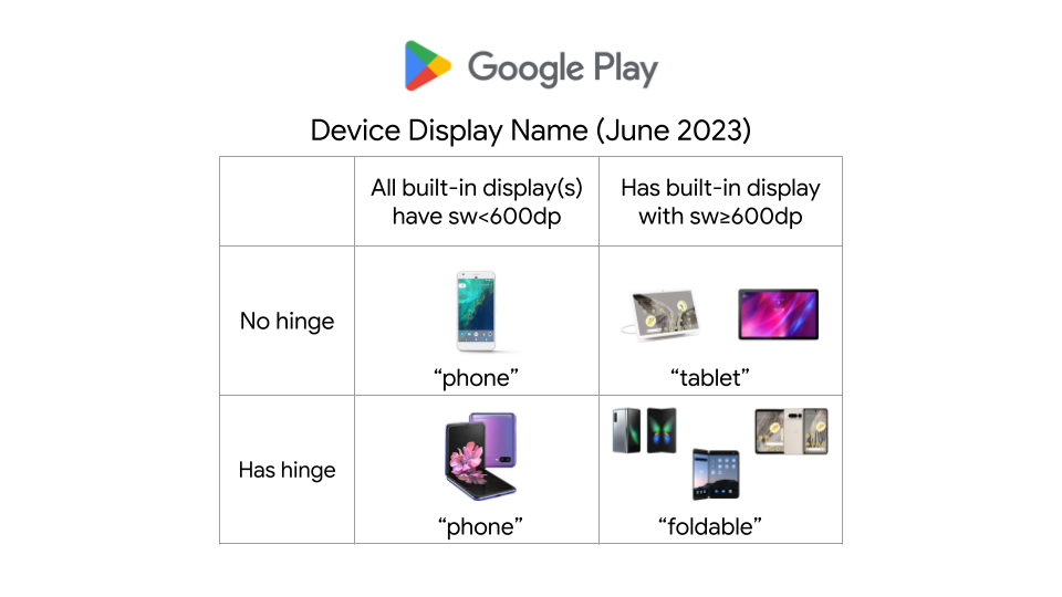
For example, Google Play currently uses the following heuristics for determining the device name to display to the user when installing an app on a particular device. The logic is specific to this particular use case, and may change as devices and form factors evolve.

If you are displaying the type of the device to the user, and want to differentiate between the physical type of the device for personalizing the experience, such as to say “download on your foldable” or to show more specific device imagery, you can use the available physical features as heuristics for which type of device the user is using. However, these are only heuristics and could change as the accepted terms for referring to the devices themselves change. As discussed above, a foldable device may or may not support other hardware features, or have a large screen.
“Foldable” heuristic:
If a device has a hinge sensor (which can be determined by PackageManager.hasSystemFeature(PackageManager.FEATURE_SENSOR_HINGE_ANGLE)), then the device supports folding in some manner. Note: While this covers most foldables moving forward, it may not cover some older foldables that don’t expose a hinge sensor. Additionally, the screen the app is being displayed on may or may not fold, the device might have an additional non-folding screen as well, or the screen may not currently be folded, even if it could fold. Devices like the Samsung Flip have a smallest width of less than 600dp, The inner screen of large-screen foldables have a smallest width of 600dp or more.
“Phone” heuristic:
99.96% of phones have a built-in screen with a width smaller than 600dp when in portrait, but that same screen size could be the result of a freeform/split-screen window on a tablet or desktop device.
“Desktop” heuristic:
Desktop devices, like ChromeOS devices, running Android apps, may expose specific features or environment information that apps can use. For instance, ChromeOS has the system feature "org.chromium.arc" or “org.chromium.arc.device_management” to enable developers to determine whether their app is running on ChromeOS. But apps running on tablets – and phones, if the user so chooses – may also use desktop-class keyboards and mice for enhanced productivity.
Understand how users are using your app on different types of devices.
Use the heuristics and features discussed above as inputs to your analytics, while keeping in mind that physical device type doesn’t give the complete story for how users are using your app on that device.
Even if the user is using a device that can physically fold, they may be using the app in multiple configurations. Users might use an app more or less on the inner screen compared to the outer screen, and they might multi-task with other apps on the inner screen. For devices that support external displays, the app might not be running on either of a foldable's built-in physical displays.
Other information that might also be relevant:
- Are there external peripherals being used to interact with the app, like keyboards, mice, trackpads, or styluses?
- Does the device have a built-in touchscreen?
- Is the app being used in a free-form windowing environment?
Don't make assumptions about what a particular physical device implies for your app. “Is the device foldable?” is a good starting point, but it shouldn’t be the only question you ask. Additional pieces of information will give a more precise and more relevant answer to your use case at hand, and each use case has different considerations that you should make to build versatile, adaptive apps.